Tips & Tricks: Double Dilutes
Double dilutes (smokey cream, perlino, and cremello) are some of my favorite colors to do. But they can be tricky colors to pull off. The body color on these is so pale that it can easily look flat, but adding too much contrast and definition can quickly turn the coloring into a weird orangey mess. I’ve had my share of poorly executed creams, but I wanted to share with you some of the things I’ve learned to do to pull these colors off right.
To do that, I have Kathi Bogucki’s Dozen Roses and a reference of a gorgeous perlino tobiano with cat tracks. I’ve had this reference for some time, and DR was just the piece to do it on. I’ll be using pastels as (at this point) I’ve found them the best option for achieving lighter colors.
Starting with a pristine prep job with white primer is key. When using pastels in such a light color, any imperfection or fleck of dust sticks out like a sore thumb. So doing a once over for dust between layers is really helpful as well. You’ll want to catch anything as soon as possible so you’re digging through fewer layers of color to pull it out. If caught soon enough, a carbide scraper with a really light touch can get the job done without damaging previous layers.
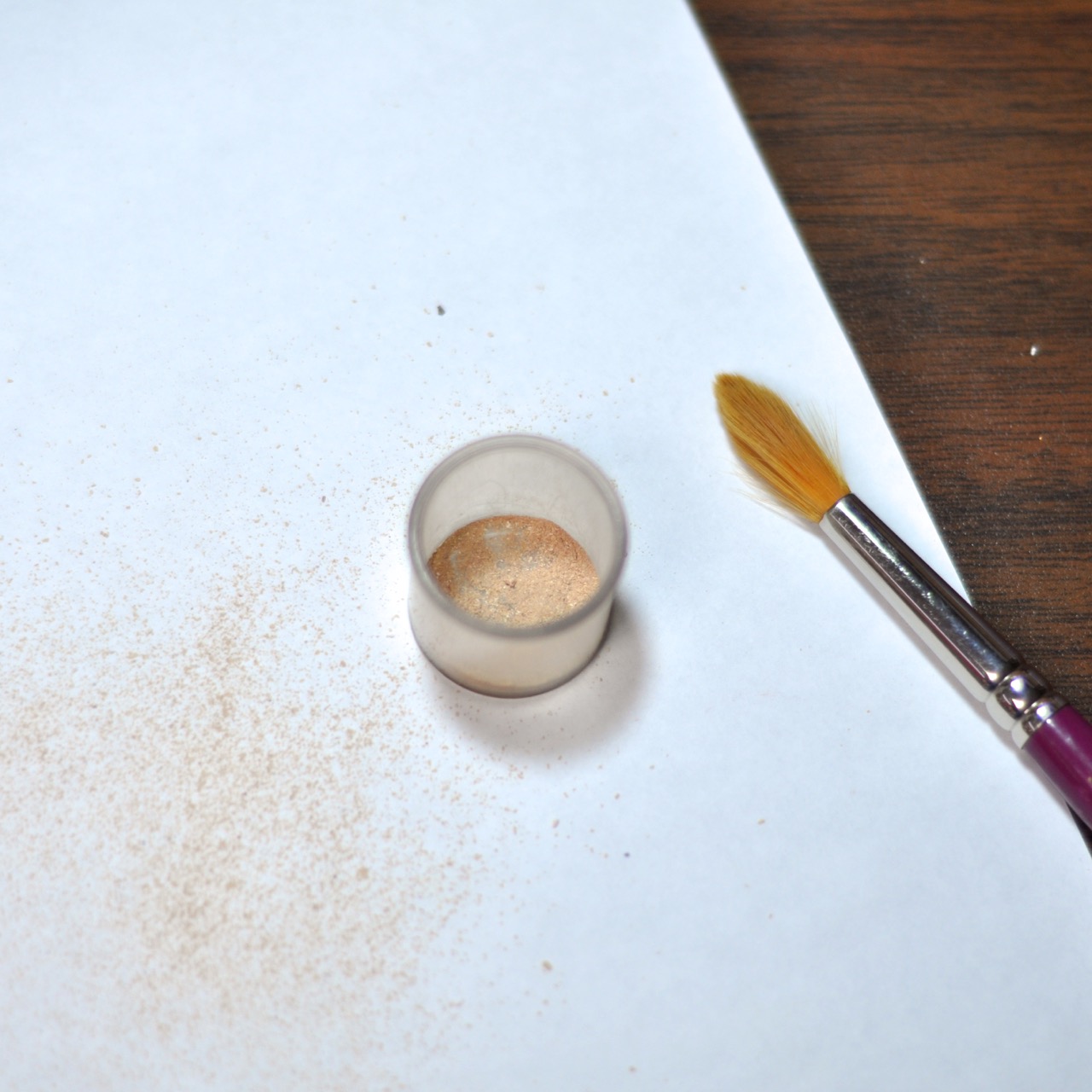
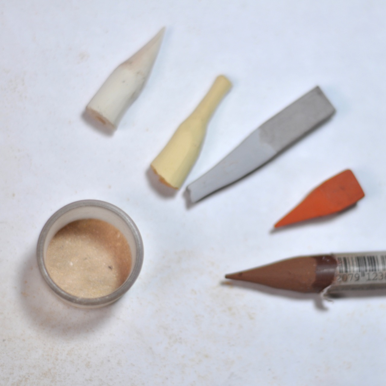
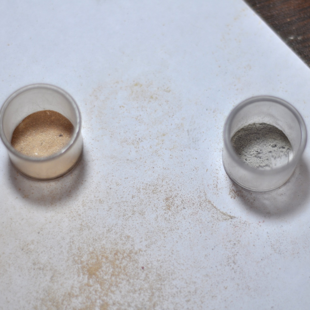
The first color I use is a mixture of off-white, pale yellow ochre, and light grey, with touches of burnt sienna and raw umber. This mixture will vary a bit, but I basically want to stay really light and match the tones as closely as possible to the reference photo. The grey in the mixture really balances the color nicely. It keeps the color from looking too saturated.
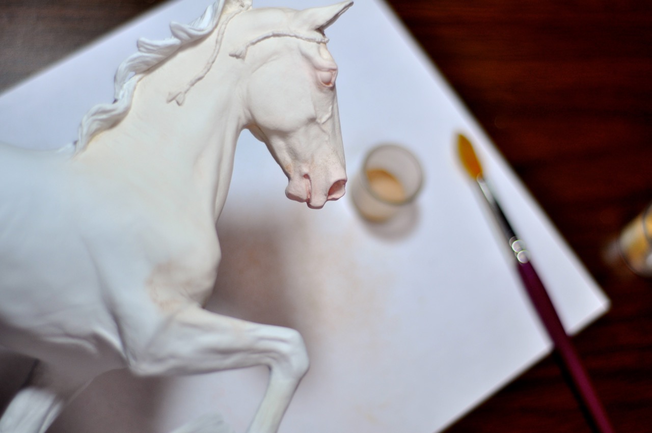
 And then I start applying with a large soft brush. I forgot to get a shot of my mixture for my pink. I use the off-white from above mixed with a burnt sienna. I apply this on eyes, muzzle, under-parts, inside ears, and tiny touches in other areas where pinking would pop through (inside legs, etc.).
 For the second layer, I kept with the exact same mixture, starting to create a little bit of definition by avoiding a few areas I wanted to keep lighter. (sorry, no photo)
For the third layer, I felt the color was lacking depth, so I slightly darkened the mixture and added more grey. I also created a second mixture of just pale grey and off-white.
 I used these two shades simultaneously. The warm tone as before, but placing the grey tone in the lighter areas such as the flank. This added some nice subtle contrast in tone. It might be a bit difficult to tell, but you can see both colors on the piece below (warm on the hip, cool on the flank).
 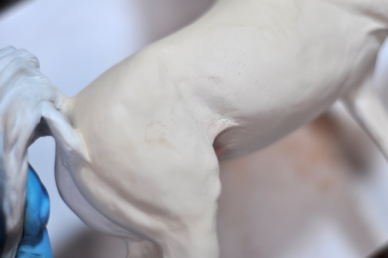 Adding grey in areas also works really well if you find your coloring is getting too bright. I also often use grey over pinking. I just think it softens the color really beautifully and somehow makes it appear more real. (Incidentally, this is also what I do for champagne skin. I start with a pink base, and add multiple layers of grey overtop until I get that perfect pink-grey tone.)
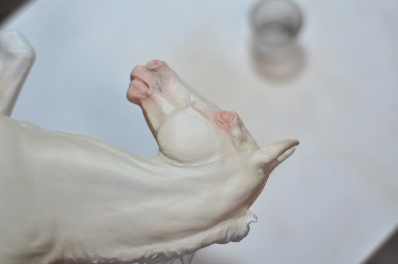 For the final layer, I took the grey tone and darkened it slightly. I then applied this in the contours, along the top line, etc. to bring out the the detail. This color really needs to be cooler in color than the your main body color. This will also tone down those areas around the mane that you can see are looking a bit too bright yellow.
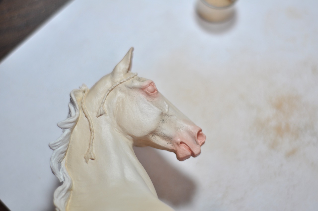 After sealing this layer, his body color is finished. Next step will be adding markings!
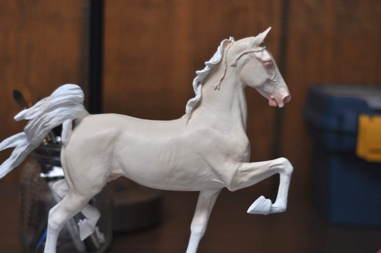 And I promise I’ll get a better shot. This dark background washes out the color. With proper photographs you will see the depth of color much better.
thanks so much for this!
cant wait to see how he turned out!